

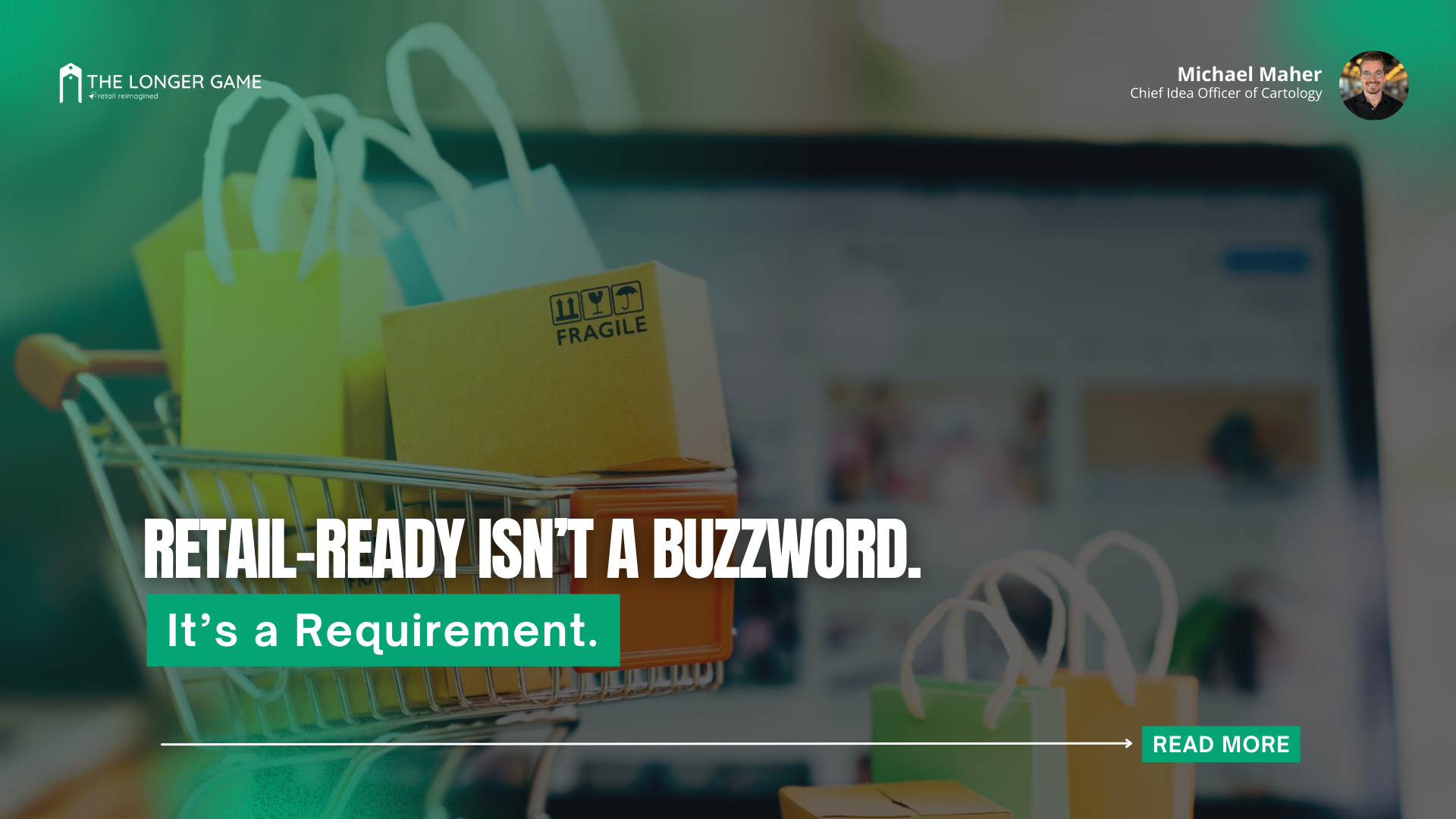
Retail-Ready Isn’t a Buzzword. It’s a Requirement.
Great taste doesn’t guarantee shelf space. Packaging does.
Ali Elliott, Founder of Farmer Foodie, learned that lesson the hard way. Her cashew parm product? Delicious. Her first packaging design? Not ready for retail. At a pitch slam hosted by NOSH Live, industry judges praised the product’s flavor but called out a major flaw: the packaging didn’t communicate the use case. It didn’t stand out. It didn’t sell the story. And ultimately, it didn’t win.
What Retail-Ready Really Means
"Retail-ready" isn’t code for pretty. It means:
Clear Communication: What is the product? What does it do? How do you use it?
Emotional Connection: Does the packaging spark curiosity or confidence in the shopper?
Functional Design: Will it survive shipping? Can it be shelved without falling over?
Compliance: Does it meet labeling and logistics requirements for wholesale or DTC?
Retail-ready packaging is about selling. Not just looking good on a mood board.
From Blog Branding to Shelf Space
When Farmer Foodie first launched, Ali used a sunflower-themed logo that worked great for her food blog. It reflected her brand’s roots in sustainability and plant-forward eating. But on a retail shelf? It didn’t convey what was inside the container—or why someone should care.
Worse, the font was hard to read. The flavor names weren’t intuitive. The branding didn’t hint at the use case.
That feedback at NOSH Live was a wake-up call. She didn’t just tweak the label—she overhauled the entire brand identity.
The Farmer Foodie Rebrand
Ali vetted over 20 agencies before choosing one that truly got her vision. The result? A thoughtful, beautifully executed rebrand that:
Introduced botanical illustrations like cashew leaves and flowers to tell the ingredient story
Refined the logo to improve readability and shelf visibility
Adjusted the flavor names to convey real-world usage (e.g., Italian Herb instead of "Everything Cheeze")
Optimized the label layout for high-shelf placement—because parmesan alternatives often get stocked high
This wasn’t just an aesthetic refresh. It was a strategic shift rooted in retail performance.
Why It Worked
Post-rebrand, Farmer Foodie didn’t just look better—it finally got shelf space. The packaging now sparks curiosity, communicates clearly, and earns attention. That matters when you’ve got three seconds to win the shopper’s eye.
It’s art with a job to do.
Key Takeaways for CPG Brands
Don’t assume good taste equals good sales
Pressure-test your packaging with strangers, not just friends
Hire people who understand brand and shelf dynamics
Never design packaging in a vacuum. Always evaluate in context
🟢 If your packaging doesn’t sell the product, it isn’t packaging. It’s art.